PAINTING 1:43RD SCALE FIGURES
by Chub Pearson
Reproduced from the book 'The World of 43rd'
a complete guide to building model cars available from www.marshmodels.com
In many ways figure painting has more in common with painting a picture than it does with car modelling. Highlights and shadows, texture and depth are needed, but these are easily observed from photos etc. 1:43rd modellers will already have all the dexterity needed, and there are straightforward techniques for achieving good results. By using two or three shades of colour and a wash technique, the model can spring to life, giving a close interpretation of the real thing. Car interiors and engine compartments can also benefit enormously from these techniques. I've seen too many plain brown car seats!
Overall:
The first step is to relate the scale of the figures with the amount of
detail you will try to represent when painting. Take a good close look
at a 1:43rd figure, holding it about eight inches from your eye. If you
scale this up it is equivalent to a real person standing nearly thirty
feet away. Small lettering on the overalls will cease to be legible, the
eye detail will vanish into the shadow of the eye socket, etc. Find some
pictures of people in magazines that are the same size as a 1:43rd scale
figure and you'll see what I mean. The point I'm making, although I know
many people will disagree, is that if you paint in details that would
not appear in reality (especially eye detail) your figure will then take
a step toward caricature. So you need to decide whether what you are trying
to represent in your modelling is reality or a sort of technicolour version
of it. It's similar to the high gloss/low gloss argument about car bodies.
A car outside viewed from thirty feet or more away however polished has
very little apparent gloss. You need to be much closer than that to see
it, so I remain firmly in the low gloss camp. I want that first impression
when someone looks at my models to be "My, that looks real",
not "My, that's got a shiny body".
Priming:
Once the figure has had all its mould lines cleaned up, it should be primed
in white. It's a good idea to give it a good scrub with an old toothbrush
in warm water and detergent to get the surface perfectly clean. I now
use the cans of White Primer you can get at motor accessory shops for
full size vehicles. These paints are now all acrylic, where they used
to be cellulose, give a good solid white and provide an excellent key
for the paint to go on top. They also add an extra brightness to reds
and yellows.
Keep the head separate from the figure. I mount the figure either in a
pin vice, or I use strips cut from the thick plastic card you can get
from any model shop. Drilling a slightly undersize hole in the card means
the peg on the figure will hold it in place while you are spraying it.
Helmets too can be mounted in this way.
Basic Brush Technique:
Tend towards expensive brushes not cheap ones. The artificial hair (sable
like) artists brushes are the best ones I've found. Size is a matter of
choice. As long as a brush has a good point there's not much you can't
do with a No. 2, but the sizes go right down to 00000, and these tiny
ones can be useful for small lettering, etc.
All brushes start off perfectly straight, but rapidly develop a curve
at the tip. Very slight at first, but it's always there once the brush
has been used. Always make sure this curve is trailing when you paint
a line. The brush will follow the line much easier than if you hold it
the other way round, with the curve going down towards the surface of
the figure. If you're painting into a corner however (touching up logo
patches for example), you'll get a better result if you turn the curve
down, putting the tip into the corner and drawing the brush away. And
always rehearse the movement of actually painting, moving the brush just
above the surface making sure that the movement along the line you want
is easy and natural, changing the position until it is (which involves
some contortions from rime to time!), before actually putting the brush
to the surface.
Don't Wobble!
There's a lot of painting straight lines and edges involved in painting
drivers, especially the modern ones with all their decorations. Always
paint with your hands locked together in some way. That way you may still
shake, but the brush and the figure will shake at the same speed! I'm
left handed, so I hold the figure in a pin vice in my right hand and then
rest my left (brush) hand against the palm of my right hand. This leaves
the thumb and forefinger holding the brush free to move yet maintains
a link between the brush and the object being painted, which I can also
turn if necessary. Putting both elbows on the table can also help to steady
the hands.
Using Varnish:
It's a good idea to put a coat of satin varnish over all the parts of
the figure that will stay white before painting any straight lines or
regular curves. The varnish over the area will both protect the paint
below and allow the paint on top to be lifted off cleanly if necessary.
Matt paint has a very 'grippy' surface, and if you try to remove a colour
from on top it will tend to just spread the colour around. You'll never
get it all off cleanly. Satin varnish has a much smoother surface, so
the semi-dry paint on top will not adhere strongly. Always varnish over
any white clothing before going near it with any shading or washes.
If (or more likely when!) you do have a twitch at the wrong moment and
mess up a curve or line, leave the mistake alone and concentrate on finishing
the curve. Once the paint is half dry (gone flat if it's matt), get together
a small clean brush, a small container of thinners, and some absorbent
material. I cover my workbench with old newspaper which is ideal. Dip
the brush in the thinners, draw it across the newspaper a couple of times
to mop up the surplus thinners, then, approaching the curve from the opposite
side to the one you've just painted draw the brush up towards the blotched
area so it lifts the paint back towards the proper line. After each contact
with the paint twirl the brush in the thinners again and wipe it on the
paper to remove any traces, otherwise you'll just put paint back onto
the figure. Sometimes I'll deliberately overpaint the line and then take
it back again in this way as it's often easier to get the curve right
when taking paint off rather than putting it on. Thin lines can be painted
by concentrating on one edge while painting, then returning with this
technique to slowly pare back the line to whatever thinness you need.
There are times when it's simpler to make the correction with the original
colour over the top, but you'll need enough thickness of paint to cover,
and the principle of the less coats the better gives a better finish makes
taking the paint off a more attractive proposition than putting more on
wherever possible.
So the first move is to put a coat of satin varnish over all the parts
of the figure that will remain white, i.e. overall logos, cuffs, etc.
With helmets it's easiest to varnish the whole thing. This varnishing
can be repeated whenever one stage is complete before going on to the
next, both to seal off the work you've done and to make it easier to correct
any mistakes in the next stage.
Marking out:
Once the varnish is dry mark out the edges of the patches on the overalls
using a well sharpened very soft pencil. This has a double benefit. It
will be far easier to paint around them with the line to guide you, as
you won't have to worry about the placing of the outline, leaving you
free to concentrate on the painting itself. Also, all the paints are opaque
to a degree, particularly reds and yellows, so the pencil line will show
through enough to give an edge to the patch even when it's painted. It'll
look more as if it's on the overalls rather than part of them. Make sure
everything's symmetrical before committing yourself to paint. If you get
it wrong the pencil marks rub off easily (use a putty rubber if you have
one, as you can make a tiny little point with the rubber).
Basic Colours:
Always have the figure mounted in some way. Pin vices are ideal' but you
can also use a bit of dowel with a hole drilled in the end to take the
figure. Avoid handling the surface as much as you can. If your skin can
take it it helps to wash your hands with washing up liquid beforehand
as this takes all the natural oil from the skin. Some skins react to it,
but you'll already know that from all the washing up you've done, won't
you fellas! This oil does transmit though, however small the amount, and
wherever it gets onto the figure it'll attract dirt and the next coat
of paint won't cover or adhere so well.
Paint on the main colour of the overalls. It'll need two coats to get
a good cover, on the second coat leave the top surfaces for the lighter
shade. If the boots are the same colour as the overalls, they look much
more distinct if you make them a slightly darker shade.
I use enamel paints rather than acrylic. I'm used to them, and I like
the longer drying time, so I've never bothered with acrylics, but all
the same techniques apply, with the sole exception that oil paints won't
mix directly with acrylics, which are water based, whereas enamels, being
oil based, will.
Shading:
Have a good look at some pictures to see how the colours change with the
shadows and highlights, stark shadows in high summer, softer by far in
the rain at Donington.
There are three methods of achieving shading, usually done in this order:
1 - by painting on a darker shade of the colour to all the undersides
of the figure. Simply darken the main colour and paint it wherever the
light would be weakest. Between the legs, under the arms, the chest if
the figure's leaning forward. Looking at the figure upside down helps.
Large creases can be shaded where they overlap. When darkening paint try
to use a complementary dark colour rather than just bunging in some black.
Reds need dark brown, yellows benefit from an ochre wash, particularly
Transparent Gold Ochre (TGO). White is a problem to shade, as grey just
makes it look dirty, but light grey shading with some TGO carefully applied
works well, as does a very thin wash of TGO but not on the top surfaces,
leaving a pure white highlight.
2 - by using wash techniques where darker shades are run over the surface.
Artist's oil paints are better for this than enamels, the paint seems
to break down finer when thinned. But they do take longer to dry. Mix
up a darker shade of your main colour and dilute it thoroughly with thinners,
thinner than ink, dip a brush in this, touch the point against the container
to take off the surplus, then if you touch it to any crease or recessed
line on the figure it will flow along that line from the point of the
brush darkening it. The edges of a belt, for example, a touch of the brush,
and a dark line whizzes half way around the figure. Sometimes you put
on too much, but then if you wipe the brush and then put it back it will
reabsorb the paint just as readily. Any smudges can be lifted off with
a clean brush and thinners if you've varnished over the area again before
you start. Washes always dry much lighter than they first appear. Always
satin varnish over any surface before using washes. On bare matt the wash
will smudge and be difficult to remove.
3 - by drybrushing to add highlights. This involves using semi dried paint,
and this is where the longer drying time of enamels comes into its own.
Lighten the shade. The paint needs to be tacky on the brush, which should
be lightly wiped flat, and then drawn over the area to be highlighted
as flat to it as possible. Paint will only be transferred to the highest
points. With larger areas you can almost scrub the paint on. If you have
to thin the paint, be careful when you reapply the brush as it will go
on much more freely. All the top surfaces should be highlighted in this
way.
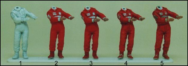
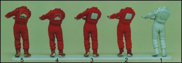
1: Primed and marked out in pencil
2: Main colours blocked in
3 & 4: Washes added, logo colours, boot detail
5: Lettering detail added
Helmets:
Once you've given the helmet a coat of gloss varnish and let
it dry thoroughly, draw out the basic pattern in pencil in the same way
as the overalls. If the helmet's in a pin vice lines around the helmet
are simple as you just rotate the helmet while dotting it with the pencil.
Then you can block in the main colours, making any corrections as described
under "Varnishes" above. Always leave any white areas. For instance,
if you've a basically yellow helmet with a white logo on it, draw the
outline of the logo in pencil and when painting the yellow go round the
logo leaving it white. The pencil line will show through giving the eye
a 'key' which tells the viewer it's a square patch on a yellow surface.
The edges don't even need to be terribly precise. Don't paint all over
yellow then go back to paint the white later. The lightest colours always
go first. Once you're satisfied, another coat of varnish, left to dry
before going for the finer detail. Lines running around the helmet should
be painted as thin as you can initially, concentrating on the 'white'
edge. Any deviation in the line will be much more apparent than it was
in pencil, so keep a watchful eye on the symmetry. The thinner the initial
line the more room you have for manoeuvre. Curves are always easier to
paint from the inside.
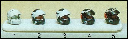
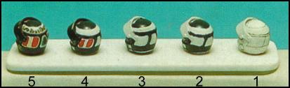
1: Primed and marked out in pencil
2: Main colour blocked in with rough edges
3: Edges tidied up before the paint has dried
4: The visor has been painted black leaving a white strip for the lettering
and secondary colour added to the helmet
5: Add the lettering, and paint in the black edging around the face aperture
and the base of the helmet
Faces and Hands:
Using Humbrol red brown No. 133 and matt white make a mix slightly lighter
than the skin tone you want (it will darken as it dries). Use your own
hand as a guide. Paint this on, then adding a little more white highlight
the upper surfaces on the hands and the forehead, the ridge of the nose
and the chin. The colour will be too pink and flat looking when it dries,
but that will be corrected by oil washes later. Leave it to dry thoroughly.
If you want to paint in eye detail, don't use white for the whites of
the eyes, but pale blue or brown depending on the eye colour. Pure white
will look far too garish to be real. Two washes are needed. Firstly a
dark brown one (50% Black 50% Brown Madder Ahz). Run that around the hair
line and neckline, with a touch on each eye. On the hands use it at the
wrist and between the fingers. The second wash is one (or more) of Transparent
Gold Ochre. Wash this all over the flesh colour. It will give a tanning
effect over the pinkishness of the colour and add a slight sheen which
will be more like skin. The more you repeat it, the more tanned the skin
will appear. But let it dry between each coat, or it'll just wash off
again each time.
Advertising Logos:
Satin varnish over before starting. You should aim to get the larger lettering
fairly legible, but smaller signs will only be dotted in. For example,
the Marlboro sign on a drivers back would be large enough to read, whereas
the smaller ones on his arms and chest would not be. With lettering, use
the smallest brush possible (0000 or 00000) and thin the paint well enough
for it to flow easily. Do the vertical strokes of the letters first, starting
at the centre of the word and working out. The sloping and horizontal
lines go in afterwards. The height can be evened out simply by painting
a white (background colour) line across the top and bottom (easy), or
by lifting the paint oil with thinners (somewhat trickier!). With small
wording, just painting vertical lines (capitals etc.) and dots lower case)
will give a good representation. Marlboro would thus become line line
dot dot line line/dot dot dot dot, and will look like it says Marlboro.
A yellow square with a black dot in makes a Ferrari badge. A red circle
with a yellow centre looks like a Shell logo. White lettering on a black
or dark background can be done in reverse, by leaving a white oblong when
painting the background - see the visor in the pictures of the helmets
- then filling in the detail between the letters in the background colour
rather than putting in the letters themselves.
Finally, once the helmet has been glued in place give the overalls a coat
of matt varnish to get rid of the satin finish from the varnishing, and
go over the helmet and visor with a good coat of gloss.
Finally:
Always remember that there are no hard and fast rules for creating a lifelike
image, everyone develops their own techniques with experience. I've just
tried to give a basic starting point for you to begin to form your own.
Colour Shading Chart:
|
Colour
|
Highlight
|
Darker Shade
|
Wash
|
|
White
|
None
|
Light grey plus TGO
|
TGO
|
|
Yellow
|
Add white
|
Add Raw Sienna
|
TGO , Raw Sienna
|
|
Red
|
Add yellow
|
Add dark brown
|
Brown Madder Aliz + black
|
|
Blue
|
Add light blue
|
Add darker blue or black
|
Ultramarine + black
|
|
Green
|
Add lighter green
|
Add darker green or black
|
Dark green + black
|
TGO = Transparent Gold Ochre (Winsor & Newton)
Suggested Oil Paints: Transparent Gold Ochre. Black. Brown Madder Aliz.
Ultramarine. Raw Sienna.
Humbrol enamels will mix quite happily with oil points, so only the Transparent
Cold Ochre, Row Sienna and Black are really essential.
© Marsh Models 1994. www.marshmodels.com